Giant Boom: A Bold Display Font for Digital Brand Impact
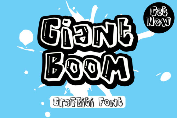
As a UI designer who ships landing pages, SaaS dashboards, and e-commerce experiences daily, I reach for display fonts like Giant Boom when the goal is unmistakable personality—without sacrificing digital clarity. It’s not just another graffiti-inspired typeface. It’s a tightly crafted, outline-heavy display font with deliberate rough texture, sharp angles, and confident spacing that holds up across devices and contexts.
Giant Boom thrives where hierarchy matters most: hero section headlines, product launch banners, course title cards, and CTA buttons that need to stop scrolling—not confuse. Its bold, high-contrast letterforms scale cleanly from 48px on desktop down to 36px on mobile without losing legibility, especially against solid backgrounds or subtle image overlays. The outline treatment adds visual weight while preserving negative space—critical for readability in fast-scanning web environments.
In practice, I use Giant Boom almost exclusively for short, high-impact text: “Early Access Live,” “New Drop,” “Join the Movement,” or a brand name in a portfolio header. It’s not built for paragraphs, navigation labels, or form fields—and that’s intentional. As a display font, its strength lies in signaling tone before users read a single word. That rough, urban energy communicates authenticity, creativity, and confidence—ideal for streetwear brands, indie music platforms, design studios, or coaching programs targeting self-directed, culturally fluent audiences.
For responsive layouts, I pair Giant Boom with a neutral, highly legible sans serif—think Inter, Manrope, or even system fonts like -apple-system or BlinkMacSystemFont. This pairing creates reliable rhythm: Giant Boom sets the emotional anchor; the sans serif delivers clarity and trust. On dark mode interfaces, I reduce outline thickness slightly via font-feature-settings (if supported) or apply a subtle inner shadow for contrast. On light backgrounds, no extra styling is needed—the font’s inherent density reads cleanly at all sizes above 28px.
When used over photography or gradient overlays, Giant Boom benefits from a tight letter-spacing value (0.5–1.0px) and a modest text-shadow (1px 1px 2px rgba(0,0,0,0.3)) to ensure separation. I avoid using it on low-contrast image areas unless a background scrim or mask is applied first. For buttons, I cap usage to primary CTAs in hero sections—never secondary actions or small utility links—because its visual gravity demands attention and space.
It works exceptionally well in specific digital contexts:
- Creative portfolios: Use Giant Boom for project titles overlaid on case study thumbnails—its texture reinforces authorship and craft.
- Boutique online stores: Apply it to limited-edition collection headers or “Just Dropped” banners—immediately signals exclusivity and attitude.
- Course sales pages: Deploy it for headline phrases like “Build Your First App” or “Design Like a Pro”—adds energy without undermining credibility.
- Blog headers & social graphics: Scale it large for featured post covers or Instagram carousels—its outline handles compression better than filled glyphs.
- Digital brand kits: Include Giant Boom as the designated display font alongside a clean body typeface and a monospace accent font for code snippets or technical details.
Readability on mobile remains strong—but only when used intentionally. I never drop Giant Boom below 32px on iOS or Android, and always test line-height at 1.1–1.2 to prevent cramped ascenders/descenders. Its uppercase-dominant structure means mixed-case usage requires careful kerning adjustments, so I default to all-caps for consistency in digital applications. Also worth noting: Giant Boom includes standard Latin character sets and basic punctuation—sufficient for English-language web projects, marketing assets, and UI microcopy, but not suited for multilingual sites requiring extended diacritics or non-Latin scripts.
Font pairing isn’t optional—it’s foundational. Because Giant Boom carries such distinct voice, it needs breathing room. I avoid pairing it with other decorative fonts, script fonts, or condensed sans serifs. Instead, I lean into typographic contrast: a generous x-height sans serif for body copy, a quiet serif like Lora or Playfair Display for editorial subheads, or even a functional monospace for technical highlights. This balance ensures the brand feels human—not chaotic—and maintains professionalism even when the vibe is boldly urban.
Licensing is straightforward but essential to clarify upfront. Giant Boom is a commercial font, meaning it requires an appropriate web license for live sites—even personal portfolios hosted publicly. Most vendors offer tiered plans covering domains, pageviews, or unlimited usage. For client work, I always confirm license scope before embedding: does it cover third-party hosting? Does it extend to template resale or white-labeled dashboards? These details protect both your business and your clients’ long-term digital assets.
What makes Giant Boom different from other graffiti-style display fonts is restraint. It avoids excessive distortion or illegible flourishes—every glyph serves rhythm, recognition, and scalability. That’s rare in expressive typefaces, and invaluable in real-world web design. When your landing page has three seconds to earn attention, Giant Boom doesn’t shout. It stands firm, authentic, and unmistakably yours.